Tutorial 8- EPG and Formant Analyses in Publisher
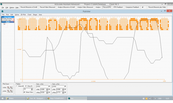
您的浏览器不支持 HTML5 视频。 Hi and welcome to tutorial eight,This tutorial details the use of EPG data in publisher and also briefly looks at the use of wave data.This tutorial is a follow on from tutorial six,Which discusses the basics and the use of supplying data in publisher.It is recommended that you see that tutorial first.If you have not yet already.The graph that I have in front of me here is made from wave data.This is called a formant analysis under create analysis,And there are three options available frequency,Width and energy.They will not be discussed here if you wish to see understand more about them.Please see their entry in the manual documentation.We will now look at use of EPG data in publisher.The demo file.It does contain an EPG data client which we will open now.You too can find it under open project client and use client W.S.Opening client data can take some time,Especially if there is a lot of data associated with the client.To find the EPG data and imported into publisher,You can use the record EPG tab at the top.As with all track data,You can highlight it by clicking and dragging in the top and then right.Click in the EPG portion and add two publisher to add EPG data.When we initially import the EPG data,We can see that it looks like a mess.The reason for this is that we have imported a large amount of data from the track,As we were importing all the associated EPG frames.For the word Anecdotal.Because the graphic of each EPG frame is so large and that there are so many they overlap.We can rectify this to make it look clearer in a number of ways.The first is to click Show N.What this does is it shows a number of EPG frames corresponding to the number entered in this box,So the number of tick marks along the top,Which you can see two by clicking show text is the total number of EPG frames of the data that you have imported.However,By limiting it to ten frames of EPG data has shown they are equidistant such that if we have only four or three.One in th
收录时间:2020-02-13T10:09:01Z
使用资料正文
Hi and welcome to tutorial eight,This tutorial details the use of EPG data in publisher and also briefly looks at the use of wave data.This tutorial is a follow on from tutorial six,Which discusses the basics and the use of supplying data in publisher.It is recommended that you see that tutorial first.If you have not yet already.The graph that I have in front of me here is made from wave data.This is called a formant analysis under create analysis,And there are three options available frequency,Width and energy.They will not be discussed here if you wish to see understand more about them.Please see their entry in the manual documentation.We will now look at use of EPG data in publisher.The demo file.It does contain an EPG data client which we will open now.You too can find it under open project client and use client W.S.Opening client data can take some time,Especially if there is a lot of data associated with the client.To find the EPG data and imported into publisher,You can use the record EPG tab at the top.As with all track data,You can highlight it by clicking and dragging in the top and then right.Click in the EPG portion and add two publisher to add EPG data.When we initially import the EPG data,We can see that it looks like a mess.The reason for this is that we have imported a large amount of data from the track,As we were importing all the associated EPG frames.For the word Anecdotal.Because the graphic of each EPG frame is so large and that there are so many they overlap.We can rectify this to make it look clearer in a number of ways.The first is to click Show N.What this does is it shows a number of EPG frames corresponding to the number entered in this box,So the number of tick marks along the top,Which you can see two by clicking show text is the total number of EPG frames of the data that you have imported.However,By limiting it to ten frames of EPG data has shown they are equidistant such that if we have only four or three.One in the middle would be the closest to the Middle EPG frame here,So,by doing this,You can ensure that you have the number of EPG frames which is comfortably visible for you.You can also change the size of the EPG frame graphics with the Y Axis plot zoom buttons here.So by clicking and holding,You can scale the EPG graphics to what is a comfortable fit.You can also horizontally scale the entire EPG graph axis with the plot zoom X axis buttons.As with any other publisher graphic,You can hold shift and drag to move the graphical object.We will now look at analysis of EPG data.There are a large number of presets available for EPG data analysis and they are highlighted in red.We are going to create one of our own.There are a large number of options available as radio buttons for EPG analysis.Mean and standard deviation correspond to the approximate position of the tongue within the mouth.You can use the buttons lower down four front back,Lateral and asymmetrical to further specify how you want the analysis to output a value.Area weighted.If we look at this here,Which we will briefly discuss.What supposing that we were using AlveolarData here.If we had this selected with area weighted,It would look at these highlighted contacts and then it would return the number,Or rather the proportion of these contacts being pressed at each time frame divided by this number of selected contacts.This differs from area total,Which would similarly look at these select contact only,But it would divide them by the entire EPGFinally,Closure gives an idea of how much horizontal connection there is across the contacts.So,For example,In the part that I am using the mouse to highlight here,This would show a high value of closure,Whereas in this one that I am highlighting,There is not much connection horizontally,Even if there may be a larger value vertically.The three final options Anteriority,Centrality and Posteriority have more information on them available in the documentation.A reference to where there are discussed can be found in the description here.For the purpose of this tutorial,We are going to use area weighted,But as you may have noticed,I was using the button Sel standing for selection here to specify the EPG contacts,Weightings.Although in the demo version there are not presets already set up,I will show you how to simply and easily set them up.This initial map here you can interact with each individual contact in a number of ways to toggle them on or off.You can double click.You can also hold down the mouse button to set our weighting of a percentage at the position of the mouse cursor.You can also click and drag to change the value which is shown in the box on the right,As you can see changing and then release the mouse to set the value.You can select multiple sel at once by double clicking on a cell to select it,Holding down,Shift and then double clicking again.You can then use this box on the right.To select the value or you can right click and choose a preset.The quickest way of covering a large area at once is a double click should hold down,Shift and double click,And then using right click.We will set up Alveolar and Velar thus,Switching tabs will automatically save any changes you have made.And similarly,In the top right,The button close will also save.If you wish to add new tabs along the top for your own specifications,You can use the add button or the delete button to get add of the tabs.Just click close when you are done,And you will not find that it.The last tab you had open will be the one selected so we can just create a new palates Analysis.And use this to select the velor one and area weighted again.We can click close now that we are done.Remember always to select the analysis you have just created.From the drop down menu.Let's just put in the graphs for the analysis now.As shown in tutorial six,We will go through the same procedure of creating an axis and then tying the analysis we have made to do this axis.We can also tie the EPG graphical data to the Axis as well.However,We do not wish to tie both axes and the functionality to tie only one axis is similarly available from Tie plots to axis the reason we would not want to tie the Y axis to the two are axis that we have created is that the Y axis on the EPG graphical object is tied to the scale of each EPG frames graphic and as such,To tie it to the axis may seriously distort this particular graphical object.So if we look at the data we have just made into a graph,We can see that it corresponds to the EPG frames at the top,So where this EPG alveolar contact proportion is shown here we can see where there is a large amount of contact at the front of the mouth.This corresponds to a spike in Alveolar and similarly,Where there is a lot of contact in the velar part of the EPG,There is a spike in the graph for velar.This concludes EPG analysis in publisher.If you would like to know more about using publisher,Including using splines,Please see tutorial six if you would like to know more about EP G data,Please see previous tutorials also.