Tutorial 6- Publisher
您的浏览器不支持 HTML5 视频。 Hello and welcome to tutorial six.Today we will be looking at Publisher,Which is a tool that will allow you to export your data in a graphical format suitable for putting into documents and presentations.So to begin with,Publisher can be accessed in a number of different ways.The most simple is that it is under the file menu and publisher.You can import data from the track and you can also import it from the edit splines dialogue and the spline workspace.The spline workspace,You can import data using the button copy to publisher to do this.Select the data that you wish to import and pressed copy to publisher.Similarly,On Edit splines,You can select the data that you wish to import,Go to the spline tap and copy the spline to publisher.Importing data can take some time,Particularly with spectrographs,Which take a long time to import and a long time to refresh on the publisher window.You can also import data from the track corresponding to its type.To do this,You can select the portion of the track that you want, right click and do add to publisher.Only some types of data supported on the track and other forms must be imported from similar dialogues such as displaying workspace.So let us look at publisher now.If you first run publisher from the file menu,You will find that it has an empty backgrounds such as this.This is because data has not yet been imported,As you noticed before when I imported data from the spline workspace or edit splines dialogue.It appeared here and gave an object heading in the lefthand menu.So the first thing that we are going to do today is we are going to look at the menus along the top.The first two to look at our file and edit both of these offer options for exporting your data and choosing some of the options for how it is exported.For example,Under edit,You can choose the bits per pixel which corresponds to how much color information there is associated with the BIT map output.You can also apply Anti-alias.Under file,Yo
收录时间:2020-02-13T06:44:44Z
使用资料正文
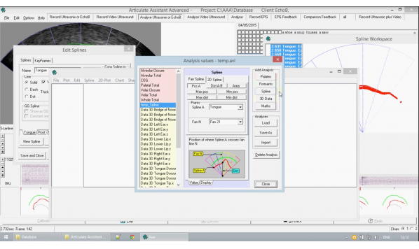
Hello and welcome to tutorial six.Today we will be looking at Publisher,Which is a tool that will allow you to export your data in a graphical format suitable for putting into documents and presentations.So to begin with,Publisher can be accessed in a number of different ways.The most simple is that it is under the file menu and publisher.You can import data from the track and you can also import it from the edit splines dialogue and the spline workspace.The spline workspace,You can import data using the button copy to publisher to do this.Select the data that you wish to import and pressed copy to publisher.Similarly,On Edit splines,You can select the data that you wish to import,Go to the spline tap and copy the spline to publisher.Importing data can take some time,Particularly with spectrographs,Which take a long time to import and a long time to refresh on the publisher window.You can also import data from the track corresponding to its type.To do this,You can select the portion of the track that you want, right click and do add to publisher.Only some types of data supported on the track and other forms must be imported from similar dialogues such as displaying workspace.So let us look at publisher now.If you first run publisher from the file menu,You will find that it has an empty backgrounds such as this.This is because data has not yet been imported,As you noticed before when I imported data from the spline workspace or edit splines dialogue.It appeared here and gave an object heading in the lefthand menu.So the first thing that we are going to do today is we are going to look at the menus along the top.The first two to look at our file and edit both of these offer options for exporting your data and choosing some of the options for how it is exported.For example,Under edit,You can choose the bits per pixel which corresponds to how much color information there is associated with the BIT map output.You can also apply Anti-alias.Under file,You can save your output it our graphics as a bitmap file of the corresponding resolution,Or you can save it as a PUB file which stands for publisher.PUB files can be considered a form of vector graphics and you when you import them later,They will retain all of the information that they had at the highest level of detail when you saved it as a PUB file.The next one we are going to look at is chart chart is the main function by which you will be making your own data or importing it.Three different latter most ones here.Wave,palates and spectrum are other ways that you can import data like many bits,This will interact with the track,Which means that when you create wave,For example,What it will do is after giving it a descriptive title.It will then import the part of the data which you had selected on the track,So in the case,Here it was the part of the wave form which we had selected just here.As a result,It is important to note that whenever you are importing data into publisher,Make sure that you have the correct portion of the track selected.Once again,We can interact with the object with the lefthand list of the object's names here and use this to delete it.Functions are also present to allow you to move The objects are forward or backward,Which we will look at a little later.Under chart also,Is that function create analysis.When you first click it,It will bring up this dialog.The drop down menu here shows a list of pre configured analyses that you can do.However,In most circumstances you will want to create your own analysis and to do this we can enter the edit analysis values dialogue.This may take a few seconds to appear.Do not worry.This dialogue here edit analysis values is very important and it may seem quite complicated initially,But do not worry.It is actually quite simple in the Left hand menu.There are a list of pre configured analyses any time you create a new analysis of your own,It will appear here.They are correspondingly color coded according to their analysis type,For example,Red analyses here correspond to palates and yellow ones correspond to 3D data.You can see the color coding in the right hand menu of buttons,Which allow you to create new analysis.Palates are red formants or green splines are blue.3D data as yellow and maths is purple or lilac.You can delete analyses that you have created with the delete analysis button.You can simply select analyses in the lefthand menu to edit therefore properties here or you can press one of the buttons on the right to create your own.For the purposes of this tutorial,We will create a splines analysis.Make sure that you give it a descriptive name,As this is how it will be remembered when you are selecting the analysis later.When you then created this window here,We'll show us a list of options which are particular to the type of analysis that you have created.So in our case,The window that we see here is specific to a spline analysis and would be different in a 3D data or palates analysis.Tabs at the bottom allow you to select other properties of the analysis,But we will look at value now.The different radio buttons here.Allow you to choose different sorts of analysis.A small portion of the window here gives you more information on what each of the buttons actually means.What analysis that does.So the one that we will look at today is pause A.What this analysis does is that it works with a fan spline and means that you choose A fan,And then wherever the spline that you have selected crosses that fine line.That is the floating point value that it will output.Thus when you make this,When you use this analysis in publisher,It will create a graph.Which will then have those values over time,According to the track data that you have selected.So we will use the tongue spline and for the fan we will select fan twenty one.The reason we are using fan twenty one is,As there are forty two fans. fan twenty one will be approximately central down the fan.So this is the only data that we need to input.When you click close,It will automatically save any of the analysis that you have set up,And you can also use the buttons,Though,To save an import here to actually save the entire set of analysis that have so far been created.We can just click, close and it will save it for us.It brings you back to this dialogue now and,As we can see,We now have our spline analysis tutorial that we had just set up now available in the drop down menu.You can give a descriptive title here and then click OK,When you are ready.So what we have now created is the data,But as it is missing an axes,It is slightly useless.So we want to create an axes,This is where the axe is drop down menu comes in useful.There are many options available to allow you to interact with any axis you have created.But what we will do now is create an axis.It has not got any associated data.According to our data.The objects listed in the left can be multi selected.You can click and drag to select multiple or you can hold down shift,When you have multiple selected those which you wish to tie,Go into the Axes menu and use Tie plots to axes.Now that we have clicked this,You will see two main changes.First and foremost,It is automatically populated our axes with the appropriate data.And in the left hand objects list,We can see that it has put brackets around the tie data One in blank and one in red.We can also notice The axes are too large and their clipping off the publisher screen.One way to deal with this is that you can reach size the screen by dragging at the corners.Another way would be to use the plus and minus buttons to re scale the axes or any other objects that you have imported.When you have tie an axis,You can still change the values here,So,For example,The data that we are looking at that we have created from our fan and from our spline,We could see corresponding to the splines that we imported,So as this is the central fan line which we were basing the data on,We can see that as time progresses,This place,Where the spline intersects with the fan does indeed go lower,And this is reflected in the graph here.However,You can then,Of course changed the values manually for the axes and you can see it immediately reflected in publisher.When you have selected any particular object in the lefthand menu,You will see it highlight at an orange.A drop down menu allows you to change various formatting options of any selected object.You can change the name,Which is how it appears in the lefthand menu.And you can also change things such as the line width and the color.You can also create other objects which are used for the purposes of graphics,For reports or presentations.Objects such as these can be moved around by clicking and dragging them and can also be resized by dragging at the corners or sides.Similarly,If we look at the moment at a filled one,We can illustrate moving up and down.So if we create a field rectangle and we move it over the data,We will find that,Irrespective of are selected data,It is eclipsing the line behind it.So if we wish to make that line visible over the top of the field rectangle,We can right click the bit that we wish to move forward and move to top or bottom apologies.And we will see that now it is.The line is now going over the top of the field rectangle.Something to note about tut axis to other objects,Such as data and analyses,Is that the two brackets correspond to tying in the X and Y axis respectively.The black lefthand bracketing corresponds to the X axis and the red right hand Bracketing corresponds to the Y axis.If you wish to save a publisher file,It will save the positions corresponding to the scaling of the window,Meaning that if you scale the window down,Save the file and then open it again.It will scale correctly to the size of your window.Three final points to help you.Firstly,When you are changing the color of an object.Because the selection color when it is selected in the left hand menu is orange.This may conflict with your use of orange in any color schemes that you create.Bear this in mind and also remember that your color will not be updated until you deselect the object.So we just change the color to green and it does not yet appear until we select a different object and see that it has indeed taken on the green color.The second point is that when you are using bits per pixel,Edit bits is the most useful one,Which has the least number of errors,While still preserving the colors that you have chosen.And finally,When you are exporting a bit map from publisher,It is what you see is what you get,Meaning that depending on the scale of the window,The only part of the data which would not be exported exactly as you see it,Is the orange highlight on a selected object.Which means if we save the BIT map,As it is right now.Although the orange highlighting is not present,It is exactly as we saw it when we had it open in publisher.This concludes the tutorial on publisher.If you would like to know more about creating splines and importing them,Please see previous tutorials if you would like to know more about the other functions of publisher.Please see subsequent tutorials.